
WordPress CSS Grid Block Proposal
Use, create, and share CSS grid layouts.
- The proof of concept plugin is on Github.
- See “Designing a Core CSS Grid Block for Intrinsic Design“, WordPress Gutenberg issue #49084.
- An example SlotFill plugin is on Github.

Rationale
In recent releases, WordPress has increasingly embraced intrinsic design as a fundamental modern styling methodology.
And since the intrinsic term was coined, the CSS Grid standard has been a central tool of intrinsic Web design.
This CSS grid block proposes a full-featured grid layout system that:
- fits the needs of both WordPress users and designers
- provides a customizable and extensible user interface
- provides access to the full CSS grid specification for designers without overwhelming users with complexity or the need to learn CSS
CSS Grid Browser Standard

The CSS Grid Module offers a powerful and versatile grid-based layout system with rows and columns
CSS grid enables an endless variety of layouts beyond its simpler cousin, Flexbox.
CSS grid is implemented in all major modern Web browsers
nearly all modern CMSs have adopted CSS grid in some form.
Use Flows
Using
- Quick and easy to use
- “Click the icon” to switch grid layouts
- Panels for customizing columns, sidebars, & cards
- No need to learn CSS grid properties
Designing
- Design mode access to all CSS grid properties
- Name & save custom grid layouts
- Block-instance CSS to add intrinsic behaviors
- Develop SlotFills to extend UI
Sharing/Locking
- Pattern, site and theme builders can share grid layout designs that are easy for users to select
- Design mode can be locked so designs are used as intended
Block Attributes
Block Attribute
CSS Grid Property
templateColumns
grid-template-columns
templateRows
grid-template-rows
templateAreas
grid-template-areas
autoColumns
grid-auto-columns
autoRows
grid-auto-rows
autoFlow
grid-auto-flow
rowGap
row-gap
columnGap
column-gap
numberNamedAreas
grid-area
Block attributes map to CSS Grid Module properties
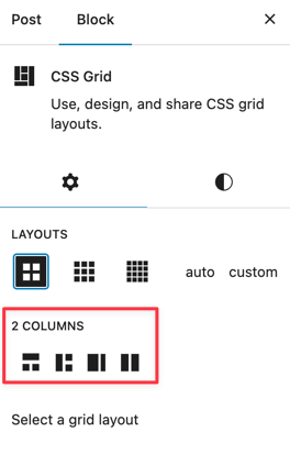
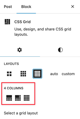
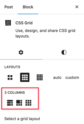
Click-the-Icon Grid Layouts
User Panels
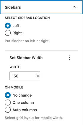
Columns, Sidebars, and Columns panel enable users to customize common grid layout scenarios:
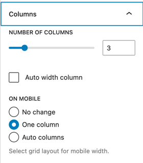

Design Mode

Design mode provides access to underlying CSS grid properties
Designers can name and save custom grid layouts

Toggle Design Mode on or off

Developing SlotFills
import { PluginGridUserPanel } from "@wordpress/edit-post";
...
<PluginGridUserPanel title={__("Columns")}
	<RangeControl
		label={__("Number of columns")}
		value={columns}
		onChange={(val) => updateColumns(val)}
		min={1}
		max={12}
	/>
</PluginGridUserPanel>
CSS Grid Resources
Kevin Powell
Learn CSS Grid the Easy Way
Una Kravets
Ten modern layouts in one line of CSS
Mozilla Developer Network
Learn Grids, Grid Reference