
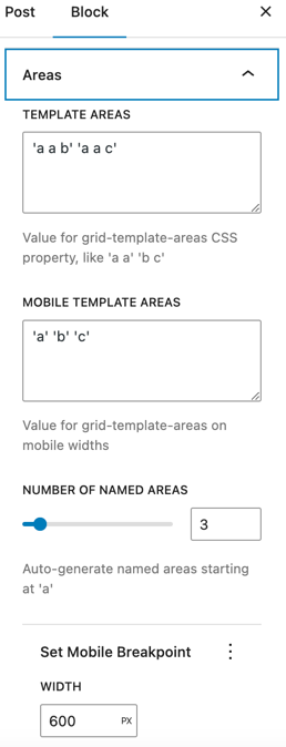
- The areas panel provides two named areas with one of them for mobile width.
- The mobile breakpoint width can be configured, as well as the number of named areas.
- Because the areas panel involves some understanding of the CSS grid properties, it appears in the Design panel, not in the user area.
One
Two
Three
Four
Five
Six
Seven
Eight
Nine
Ten
Generated CSS for the layout above:
.wp-block-b2wp-grid.grid-areas {
  display: grid;
  grid-template-areas: 'a a b' 'a a c';
  row-gap: 1rem;
  column-gap: 1rem;
}
.wp-block-b2wp-grid.grid-areas > :nth-child(2) {grid-area: a;}
.wp-block-b2wp-grid.grid-areas > :nth-child(3) {grid-area: b;}
@media screen and (max-width: 600px) {
  .wp-block-b2wp-grid.grid-areas {
    grid-template-areas: 'a' 'b' 'c';
  }
}
Custom CSS on mobile for the layout above:
@media screen and (max-width: 600px) {
  .wp-grid-name {
    grid-template-areas: 'a' 'b' 'c';
  }
}