
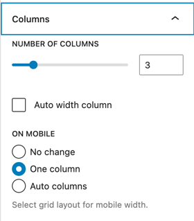
- The columns panel creates a configurable number of columns, with a minimum configurable width.
- The columns can be fixed or auto width.
- On mobile, the layout can collapse to a single column or auto columns or not change at all.
Three columns, one column on mobile:
One
Two
Three
Four
Five
Custom CSS for one-column on mobile:
@media screen and (max-width: 600px) {
  .wp-grid-name {
    grid-template-columns: 1fr;
  }
}
Four columns, auto columns on mobile:
One
Two
Three
Four
Five
Six
Seven
Eight
Nine
Ten
Custom CSS for auto-columns on mobile:
@media screen and (max-width: 600px) {
  .wp-grid-name {
    grid-template-columns: repeat(auto-fill, minmax(min(10rem, 100%), 1fr));
  }
}
Auto width columns:
I am a very, very long column, indeed
Short column
Three
Four
I am a very, very long column, indeed. I am a very, very long column, indeed. I am a very, very long column, indeed
Six