
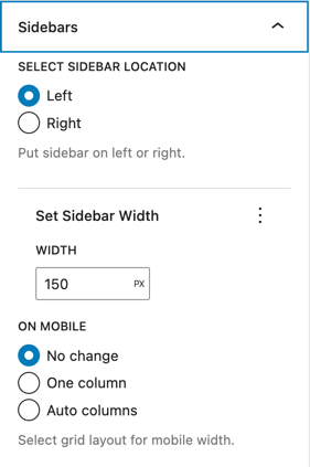
- The sidebars panel creates a left or right sidebar with a configurable width.
- On mobile, the layout can collapse to a single column or auto columns or not change at all.
Right sidebar, 200px width, one column on mobile:
Left
Right
Custom CSS for one-column on mobile:
@media screen and (max-width: 600px) {
  .wp-grid-name {
    grid-template-columns: 1fr;
  }
}
With multiple inner blocks:
Left sidebar, 20% width, auto columns on mobile:
Custom CSS for auto-columns on mobile:
@media screen and (max-width: 600px) {
  .wp-grid-name {
    grid-template-columns: repeat(auto-fill, minmax(min(10rem, 100%), 1fr));
  }
}